

Geo TV is regarded as one of the most consumed and influential television channels in Pakistan. The channel has churned some of the highest-rated television ventures of recent times, be it the Baraat Series, the Khuda Aur Mohabbat franchise, Khaani, Deewangi, and even the recently wrapped Fitrat; the channel is setting new standards of scale and vision in the television industry. Along with the love and appreciation that the channel’s dramas get, there have been frequent complaints by the audience regarding the visual elements of their screenplay.
Pale colour-grading
Geo TV’s graphics have come under the public scanner as the audience has found the colour-grading to be overly saturated with an over-do of yellow and black colour palettes and lighting. The pale colour saturation makes the screenplay of its dramas look monotonous and at times shallow. It isn’t just a fluke, but rather has been the case with most of the dramas from the channel including the likes of Raaz-e-Ulfat, Main Agar Chup Hoon and Kasa-e-Dil. The screenplay gets dominated with yellow and orange shades and that doesn’t just make the frame less colourful, but also makes the actors fall victim to bad make-up faux pas.
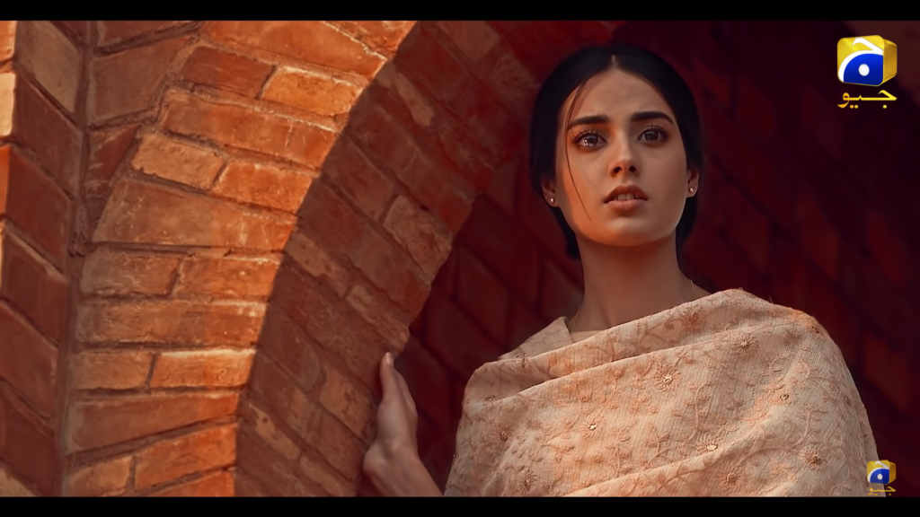
The latest case of the pale colour-grading artefact of Geo TV is the OST video and trailer of Khuda Aur Muhabbat 3 headlined by Feroze Khan and Iqra Aziz. The opening shots of the promo which showcase beautiful landscape and architectural endeavours of the country have been given the same dark colour-grading treatment which takes away the natural elements from the cinematography. The promos of the latest soap by Geo, Mujhe Khuda Pe Yakeen Hai starring Agha Ali, Nimra Khan, and Yashma Gill, also has dark and pale graphical elements. It makes the visual narrative look more fictional and lacks a realistic touch.
The consistent paleness at times conflicts with the contrasting colours of production design and costumes and makes them look similar which further deteriorates the novelty of graphic visuals. In many scenes of Kasa-e-Dil, the make-up work of the cast looks extremely dull due to the orange-ish colour-grading.
The channel should be more conscious of its future dramas as so much hard work and effort at times translate into a dull screenplay. The editing teams should be more experimental with the colour-grading/ saturation technique. Alif and Dil-e-Gumshuda have been amongst the better projects in terms of colour-grading and visual editing from the channel. More such efforts should be consciously made by the makers.


